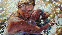
Detail of Svelata, by Mia Tavonatti, second-place winner of ArtPrize 2010 /David Guthrie, courtesy of the Rapidian Flickr pool

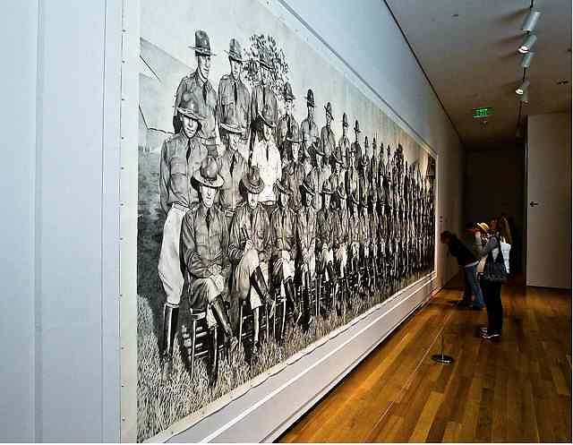
ArtPrize goers looking at Calvalry, American Officers, 1921 /Richard Deming Photography, courtesy of the Rapidian Flickr pool

Detail of Svelata, by Mia Tavonatti, second-place winner of ArtPrize 2010 /David Guthrie, courtesy of the Rapidian Flickr pool
I suppose it is no surprise that Cavalry won. The only thing we midwesterners love more than work is a righteous affirmation of work. I have a lot of respect for the skill and scale of the drawing. Without question, the draftsmanship is stunning. But what exactly do I get from looking at Cavalry, American Officers 1921, that I can’t get from the photograph and a magnifying glass? Technical ability is a prerequisite, not an end in itself. In his statement, Chris LaPorte wants to make an argument for the wholeness of it. OK. But why is that wholeness best represented in a completely faithful outsized pencil drawing of a documentary photograph?
The drawing shows me who wore spurs in their morning ride (and which riders rely on those spurs more than others), the variety of jodhpur fasteners available for the 1921 US cavalry uniform, trends in field boot styles, and the alarming weight of the whips used on their horses—information I might have missed in the photograph, but probably not. Perhaps critic Roger Green can help me see something I missed: “His drawing skills evoke the sense of wonder convincing illusionism has always inspired. Little surprise that our Paleolithic forebears accorded magical properties to cave paintings. LaPorte continues that primeval tradition, investing departed soldiers with new life in the contemporary world.” Hmm. I think what he means that LaPorte’s hyperrealism creates a sense of wonder. But of a military portrait? A scene we have seen over and over again? Really?
And second place has gone to further the important aesthetic advancement of Malibu living room art! Fabulous. The first and second place winners suffer from the same flaw: They are both exceptionally detailed works, both of which required terrific talent and skill to compose. But their subject matters have no apparent aesthetic merit. Both works draw our attention to the creation of the thing, not to the thing itself. How many times have you heard how many hours it took to make these? It’s not irrelevant, but it certainly isn’t the point.
It’s true that LaPorte’s technique is above and beyond the cleverness of the pixilated pieces (last year’s thumb tacks, this year’s Rubix cubes, corks, crayons, marbles). But take the winning work and look at it next to, say, the hyperrealism of Chuck Close’s Big Self-Portrait, a massive acrylic, 11-by-7 feet, painted between 1967 and 1968.
The aesthetic power of the subject in Close’s Big Self-Portrait is immediately alive and present—a transient moment captured in the curl of smoke, the impudent expression, the photographic fineness of each pore and hair. Big Self-Portrait says less about the execution of the painting (which is impressive on its own), and instead thrusts upon us an overwhelming act of self-examination. “I am not making facsimiles of photographs,” Close said. It is impossible to look at this painting in person (it’s at the Walker Arts Center in Minneapolis, if you ever have the chance), and not confront painting’s aesthetic force. It encourages the viewer to go beyond mere wonder at the technique and to experience and engage it. Like the technique in David Sprigg’s Vision (which should have ranked higher than it did), Close’s technique falls away in the service of a greater master: the aesthetic power of the subject.
Marianne Moore, who studied and wrote about the visual arts, wrote in her poem, “When I Buy Pictures,” “It comes to this: of whatever sort it is, / it must be ‘Lit with piercing glances into the life of things’; / it must acknowledge the spiritual forces which have made it.” The point is not to celebrate and bring attention to the individual. We have enough of that already, don’t we? These subjects fall flat: soldiers; damsel in water. And? If the audience is ooohhhed and ahhhed enough by the craft, it seems, they stop asking questions of the art itself.
American poets, painters, and philosophers have long wrestled with what distinguished American art, literature, and thought from that of the Continent. For many, it was movement itself, the tension between the constancy of transition and the longing for epiphany. Art became an answer to that longing, what Ralph Waldo Emerson called the path of the creator to his work. Art was not a record as it was in the Old World traditions, but an event. I’m not saying good art has to be abstract expressionism. What I’m saying is that art has the capacity to address harder questions than, How well can you render a picture? I’m thinking of questions like, What does it mean to be alive in this place, in this cultural and historical moment? To answer, the artist must have the skill, of course. And the artists in the top ten have skill of some sort, or at least persistence, which is on its way to skill. But you also must reveal something only you, the artist, can show us. And it can’t just be about you.
My vote went to Beili Liu’s Lure/Forest or Lure/Wave. It was my early favorite, partly because of the happy accident of seeing it first thing opening night. By chance I met the artist and her husband, Blue, and got a first-hand explanation of how the piece was made and how they troubleshot unexpected setbacks. As most know by now, the piece is 3000-4000 disks, hand-stitched with bright red thread and hung in a wave-like composition. Individually, the disks shimmer with light and movement, enlivening an otherwise unremarkable industrial-looking room. The sheen on the disks gives the piece an aquatic, kinetic feel, as if all the disks are in constant motion together, whether they are physically connected or not. The disks take on the pulses of the space not independently, but together. This is not a mere illustration of a Chinese legend, as one critic has suggested. The legend of the red thread may be the originating force, but the piece goes far beyond that to evoke an organic holism to which we are all inextricably tied. The connections, seen and unseen, take on multiple meanings—they are not just intimate bonds, but bonds that connect us in ways we may not even know.
The Rapidian, a program of the 501(c)3 nonprofit Community Media Center, relies on the community’s support to help cover the cost of training reporters and publishing content.
We need your help.
If each of our readers and content creators who values this community platform help support its creation and maintenance, The Rapidian can continue to educate and facilitate a conversation around issues for years to come.
Please support The Rapidian and make a contribution today.
Comments
"Both works draw our attention to the creation of the thing, not to the thing itself." I agree.
This is a very cohesive, well articulated and thoroughly researched article. hooray for citizen journalism!
Yes...well said. These are exactly the thoughts I've been trying to articulate since the top ten was announced...
I imagine that, like last year's winner, a lot of people voted for these two pieces because technical mastery bumped them over the threshold into recognizably "real" art, but they’re not so conceptually out there that people felt alienated by them.
I don't think it logically follows, though, that there is nothing else to these pieces. It's interesting that LaPorte employs the ritualistic repetition of lines, man's oldest art form, in an attempt to reinvigorate a static, mechanically-produced image of people long dead. It’s interesting that, like Velásquez's Las Meninas, this image incorporates its own antecedent; without that photograph, Cavalry never would have existed.
It also raises questions about the extent to which images can capture life. Detailed drawing, on this scale, becomes a meditation, like counting a rosary. Does the artist’s meditation somehow imbue this image—which is so controlled it reads as repressed—with more “lifeness” than a camera could?
I’m unsure what constitutes “Malibu living room art” but I suspect there’s more to Svetlana than that. First of all, the subject looks an awful lot like the artist, who used to be in the Air Force and now paints/mosaics pictures of women in shroudy/cloudy (yet beautifully rendered) fabric. There’s gotta be something there.
In the context of artist’s oeuvre—and, possibly, the upcoming Svetlana World Tour—I see some gender themes: how do women see themselves and how do women want to see themselves. What archetypes does this piece reinterpret? What fantasies does it play into?
I’d delve into this all more deeply, but the music on the Svetlana website (not to be confused with the Art by Svetlana website) made me so relaxed that I have to go sleep.
You make some good points and I think many of these would apply for any image done in this style: highly detailed, enlarged pencil and paper copy of a photograph ("the ritualistic repetition of lines," the fact it "incorporates its own antecedent," the relation between the lifeness of a drawing and a photograph, and the meditative character of the process).
But what if LaPorte would have chosen Steiglitz's Steerage, instead?
http://upload.wikimedia.org/wikipedia/commons/e/eb/Stieglitz-Steerage291...
Then all what you say would apply--it would even be a reinvigorting image of "people long dead"--but it also would be a drawing of a work with immense aesthetic power. It would make sense to look beyond the process to the artistic power of the image. There would be additional interesting questions as he would be reproducing such a famous image, though one not many are familiar with.
(Maybe Laporte will take requests for next year's drawing.)
Of course drawing Steerage might have lost LaPorte the vote; soliders seem to be more popular than immigrants these days.
Well written piece - agreed
Thank you for all these comments!
I dare not quibble with the soporific qualities of Svelata . . .
In response to another point, I enthusiastically recommend "The Gift: Creativity and the Artist in the Modern World," by Lewis Hyde, which takes on some of these difficult issues related to the value of art in our time.
The enterprising strategies of many of the artists have been pretty obvious this year: realism, water, centrally located, large. It will be interesting to see if the quality of the art and the conversations around the art improve or not next year.
Great article Mara. It will also be interesting to see if the damage to ArtPrize has been done. That the real contemporary art world out their now will brand ArtPrize as a conservative show for conservative realism.
Thank you, Richard. I do hold out some optimism, but you may be right. The nice thing is that the sheer volume and some serious curating have given space and visibility to some other truly interesting pieces. The award, in terms of what it means for art, is meaningless. But it's hard to say a quarter-million is meaningless. I defer to Lewis Hyde to make that point.
Well put Mara!
Your closing sentiment about Lure beautifully illustrates it as an example of gestalt theory. The technical execution of the work combined with both its cultural-historical reference and conceptual statement elevate the whole beyond summation of its parts.