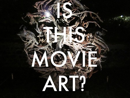
On Wednesday night at the Hub (155 N. Division), Brett Colley – an artist and professor at GVSU – ran a panel on the international art (all 52 pieces of it) in Art Prize, and the complications of choosing an “international award” for the competition. The room was packed, though the freebie chocolate covered cherries (Michigan cherries) might have helped park butts in seats. I know the bottle of Huma-Lupa-Licious parked mine.
Colley made a fascinating critique of what he called “movie art” – high-concept, “one-liner” art, dreamed up by screenwriters “trying to imagine what somebody would do to capture a lot of attention,” Colley said. I immediately thought of the enormous heads in Cronenberg’s Scanners, and if you didn’t think that reading this, then you need to go rent Scanners.
One of Colley’s criteria for quality (he’s one of the judges of the international award) was asking, “Is this piece part of a larger body of work?” Colley said. “And do I want to see it?” He seemed to be saying, does the piece imply a bunch of equally interesting work to follow? Even if we only get one piece per artist in the competition, Colley wanted the sense of greater intention and practice. An independent film producer I know calls this the “wanna-see” factor: that feeling you get during a preview, of imminence. Or more to be revealed. Of more to come.
The comment made me think a lot about the Top 10 contenders, and how would they fit on Colley’s scale. Given the massively public quality of the competition, in a way, “movie art” has a strong advantage: people are taking the work in quickly and can’t commit to long span of attention and reflection. Plus, it’s a social event — and the successful pieces, I think, are also the most describe-able. Perhaps no piece better exemplifies “movie art” than “Steam Pig”. Sure it’s playful and monumental in a way few pieces are in the competition. But it’s about as weighty as the styrofoam that makes it. And I can’t imagine more work in this series being anything but redundant. Oh wait, there goes a duck with a piece of Nessie in its mouth.
“A Matter of Time” and “Vision” have similar “movie art” status, for me, in that they seem like just the sort of work you could perceive in the background while Jude Law and Julia Roberts gave each other meaningful looks in Closer. But with David Sprigg’s “Vision”, you have the sense that a method is at work that is entirely his own, and even if I have no idea how this piece represents “strategies of power” (so says his artist bio), it feels oblique enough, subtle enough to not exhaust itself as a gimmick. I definitely want to see more.
Other contenders like “Cavalry”, “Lure/Forest”, and “salt & earth” are pieces with strong “wanna-see” — the individual piece is impressive, but I’m eager to understand the specific achievement in a broader context of an artist’s portfolio. I know Chris LaPorte loves drawing, but does he always draw military images? And if so, why? How many other kinds of thread-based environments has Beili Liu designed? We have the advantage of being familiar with Young Kim latest work, but his biggest competition might be the elegance of his own entry last year.
The Rapidian, a program of the 501(c)3 nonprofit Community Media Center, relies on the community’s support to help cover the cost of training reporters and publishing content.
We need your help.
If each of our readers and content creators who values this community platform help support its creation and maintenance, The Rapidian can continue to educate and facilitate a conversation around issues for years to come.
Please support The Rapidian and make a contribution today.


Comments
I'm digging Austin's perceptive writing on context. More please.
Art can be described by trying to get ones mind around the content of the artwork and it's context. In this regard ArtPrize seems focused on replacing "THE" context with "A" context. In this cult of positivity nothing is ever really defined because it's all made to be a matter of opinion.
This morning I watched the video of the Critical Discourse ArtPrized organized last week where they gathered a group of art professionals to talk and lead a discussion on the top ten. The moderator went to great lengths to attempt to explain that there are reasons for how we should look at art and there are questions we need to ask about what we are looking at in order to fully be able to assess and access the work. This was followed by some great presentations by the panel on each of the top ten.
After all that ground work, after all the time spent on an attempt to educate people about real objective artistic concepts, concepts that help us define what art is and can be, Jeff Meeuwsen the UICA director, in a most Cronenbergian ending, concludes by saying the great thing about ArtPrize is that we all get to have our own opinion. No definitions, period. Pig crumbles to the ground. Fade to black. Cue ArtPrize theme song.
Sounds like a good discussion (well, at least most of it) -- I'd love to hear it. I assume it's this one?
And I added the z in endingz in honor of Existenz, the one Cronenberg I can't get all the way through.
A