Urban Institute for Contemporary Arts invites you to learn more about West Michigan's creative workforce, neighboring cultural organizations, and about ways to engage with Grand Rapids' art-scene with interviews and guest features highlighting our local and regional community members. Visit uica.org/learn for monthly interviews.
His artwork has been featured in Arcadia Magazine, Studio Visit, Metropolitan Home, Solace, and American Craft. Apple, ForeSee, Hayworth, Urban Institute for Contemporary Arts, and Frederick Meijer Gardens and Sculpture Park are a few of the organizations who have utilized Pfleghaar's artwork as illustrations.
In 2016, Pfleghaar attended the Spread Art Artists Residency in Detroit, MI and in 2013 was awarded the Joan Mitchell Foundation’s Ox-Bow School and Artists Residency in Saugatuck, MI. His work was included in the 2012 LGBTQ exhibition ReMix: Revisiting Appropriation, curated by Jonathan Katz in San Francisco, CA. His original artworks are in permanent collections including the Grand Rapids Art Museum, Frederik Meijer Gardens and Sculpture Park, Steelcase Inc., Herman Miller, the State of Michigan and Grand Valley State University.
Michael Pfleghaar is exhibiting his work at UICA as part of Color of the Year Presented by Pantone and X-Rite Apr 6, 2018 – Jul 29, 2018.
How would you describe your work?
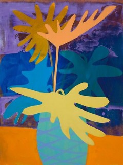
Interpreting a three-dimensional form into a painting is the ideology behind my work. My paintings have found their place somewhere between representation and abstraction through deletion, isolation, and exaggeration of inanimate objects.
Modern furniture, lighting, and architecture inspire the work because of the inherent abstract structure. Through abstraction, I am able to capture the spirit of modern design while creating a new entity. Landscape, still life, and interiors are other genres in which I work.
Physicality is stressed in the work through material use and how it relates to the forms inspiring the paintings. This illustrates the paradox I find in painting; it can be referential of something or an object itself, yet these two opposing views are really inseparable.
You’re exhibiting as part of Color of the Year. How were you inspired by Ultra Violet in the works you’ve created and/or was this a departure from your process?
Since color is a main characteristic of my paintings, Ultra Violet was not much of a departure in my work. I had created the painting “Purple Play” last year before Pantone announced the color for 2018. The other works were then created around the theme of the color.
“Purple Play” is one of only three works in the show for me. Being the largest, 36 x 36” I guess it would have to stand out above the others.
I have had many painter mentors through the years that have influenced me in many ways. It would be hard to quantify one over another. I think most artists would feel the same.
What new projects do you have on the horizon?
In the fall I will be working with a new gallery in Palm Springs, CA.
Electronic Dance Music and Mid-Century Modern furniture and architecture
What’s the best piece of advice you have heard and repeat to others?
Don’t become an artist.
Where can we find more of your work? Is your work available for sale or exhibiting elsewhere?
Locally at Light Gallery and Studio on Division, Saatchi Art online, and pfleghaar.com
The Rapidian, a program of the 501(c)3 nonprofit Community Media Center, relies on the community’s support to help cover the cost of training reporters and publishing content.
We need your help.
If each of our readers and content creators who values this community platform help support its creation and maintenance, The Rapidian can continue to educate and facilitate a conversation around issues for years to come.
Please support The Rapidian and make a contribution today.


