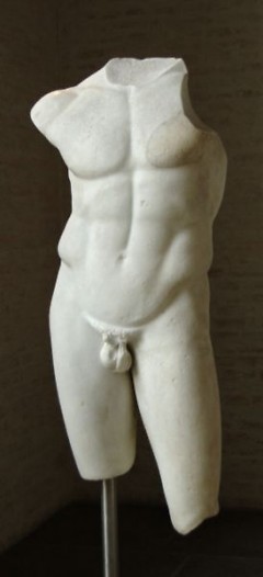
Torso of Apollo, Roman copy after a statue of the school of Polykleitos, ca. 430–420 BC /Villa Ridolfi in Rome, acquired in 1812 by Wagner for the Glyptothek, Munich

Aloft, by Andi Steele /Used with special permission from Richard Deming Photography
This article includes mature content:
Article has an image of an ancient, nude sculpture.

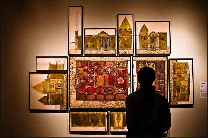
Looking at Ulu Camii, by Mary Griep /Used with special permission from Richard Deming Photography

Torso of Apollo, Roman copy after a statue of the school of Polykleitos, ca. 430–420 BC /Villa Ridolfi in Rome, acquired in 1812 by Wagner for the Glyptothek, Munich

Aloft, by Andi Steele /Used with special permission from Richard Deming Photography
So what does it look like when we talk about art? If it’s just personal, the conversation dwindles into a three- or four-syllable declaration. That’s a pretty thin answer to 1,713 artists who have labored at their own expense to create, dismantle, ship and install works for two short weeks.
Why do we like them? What do they do? Are they good? Let’s leave high theory and its murky jargon at the door (and that includes some artist statements). It hides more than it clarifies. Instead, tell us what you see.
But how to look? If you live with a professional philosopher, as I do, you can’t think about judgment and not ask for a mini refresher on Immanuel Kant over breakfast. I promise, this will be short.
Kant tried to reconcile the subjective and objective elements of judgment—why are we surprised when someone disagrees with us on whether something is beautiful or not? What is good art and what is bad? It doesn’t really matter how Kant solved this (see Critique of Judgment if you want to chew on it). What is helpful, though, is a distinction he makes: Whether someone likes a work of art is separate from whether someone thinks the work is good.
Our judgment, which is what ArtPrize invites, occurs where the privacy of emotion, the grammar of craft, and the substance of vision conspire to reveal something that we could not have conceived of before. “Like” is not enough to jostle us out of the anesthetizing force of complacency. If a work of art (or anything for that matter) hits only the notes we want to hear, how will we know what we are missing? What’s confusing about ArtPrize is that we are asked to give a thumbs up or thumbs down. When we vote for a piece, are we saying “I like it” or “It is good art”?
When we discern good from bad, we are asking how well a work of art reaches us and changes how we see the world. Rainer Maria Rilke, in his poem “Archaic Torso of Apollo” (which he wrote just after beginning to work for the sculptor Auguste Rodin), describes just how powerful art can be. He stands in front of the headless object, and yet the poet feels the god’s gaze. If it were just another statue, it would appear defaced. Instead, it gleams with power: “for here there is no place / that does not see you. You must change your life.” Just when he thought nothing mattered, the poet finds himself staring back at every choice he ever made.
Take last year’s winner, Open Water. I like it, but is it good? The water's depth requires terrific skill to render on canvas. The colors are pleasing and the scale overwhelms; it’s beautiful, powerful. But what does the painting want to show us? It shows me the painter is virtuosic. Does the art work to make me feel something I couldn’t imagine before? Not so much. Is this a shortcoming of my looking? Very possibly. It may move others (that’s the democratic part), and that’s fine. I find, however, that while Open Water is lovely to look at, but ultimately, asks nothing of me.
It would be easy to overlook some fine pieces in ArtPrize. Please don’t.
Ulu Camii (The Great Mosque of Divrigi Turkey) by Mary Griep, on the third floor of the Public Museum, is a group of drawings that is as massive as it is intricate, an homage to those qualities in the mosque itself. It’s one of a series of similar studies of twelfth-century buildings (can you imagine an entire gallery filled with pieces like this one?). The rendering allows us to experience the mosque's detail and design in a way that surprisingly intimate and reverent at the same time—a stripped-down and reconfigured experience of the sacred.
Heechan Kim’s Form # 8 at GRAM is a beautifully organic and improbable three-chambered shape. The materials, copper and wood, materials we rarely associate with movement, come together as if they are in a kinetic state of negotiation. Virtuosic skill with the medium? Check. But the piece goes further: the improbable tensions between the warmth and structure of wood, the piercings of copper, and movement of the form transform the piece from object to metaphor.
“The Scar Project” by Nadia Myre, in the Kendall building, is one of the best of the participatory pieces this year. Viewers stitch marks on small square canvases with simple, neutral materials. Each piece is mounted in a grid pattern to create a skin of stories over the walls. The limited materials create a visual coherence and a tactile testament the intimacy and universality of suffering. The stories, handwritten and stored in a box, are almost more moving read apart from the piece they describe—epistolary gestures to anyone who cares to take the time to look.
There are countless other pieces that are worth looking at more than once. At the GRAM there’s Alexis Portilla’s Court of the Red King, a wonderful abstract expressionist exploration of form; Betsy Timmer’s Rag Rug, a rope dress laden in domesticity (these two are positioned beautifully together with Heechan Kim’s piece); Bernard Klevickas’ Bluewaveforms; and John Adduci’s Blaam O.
At the Urban Institute for Contemporary Arts on Fulton, of course, Beili Liu’s stunning and nuanced Lure/Forest, but also Renee Zettle-Sterling’s Object of Mourning, which painstakingly stitches together a bond between living and grieving. In the Louis Campau Promenade there’s Norman Mooney’s compelling Star 1 (don’t be deterred by his artist statement).
At UICA on Sheldon, Wayne Belger’s amazing handmade camera in Untouchable, Andi Steele’s Aloft, Tracy Featherstone’s hilarious Is This Climactic?, Christopher Meerdo’s Stalemate (don’t bother with the artist statement here either), Lora Fosberg’s You Can’t Fall Off the Floor, Chang Kyun Kim’s glaring but seductive Silent Scream, Mark Wentzel’s XLounge Series (which made me laugh out loud), Martijn van Wagtendonk’s delightfully whimsical Surge (though, sadly, it didn’t last more than a couple days).
At Meijer Garden, don’t miss Dusty Folwarczny’s Give; Jeff Tippet’s The Original Art Vending Machine; Steven Mankouche, Joshua Bard, and Matthew Schulte’s stunning and elegant Spring Back; Amanda Katz’s Vessel; John Warner’s Impetuous, Deborah Davidson’s Stand, Ellen Rogers' amusing Intelligent Design, and Albert LaVergne’s Arch.
And this is a short list.
Auguste Rodin once said, “Nothing is ugly to the artist.” Even ugly art has something to say, though it may not be what the artist intended. Nothing is beneath interpretation.
Good art works balance a confluence of medium, tradition (yes, here’s where a little art history might help), and skill to show us something we might have otherwise missed. Even the better artworks at ArtPrize might not all pack Rilke’s sucker punch, but they have some kind of power to work on us, and we should try to let them.
Disclosure: A drawing by Griep (a precursor to her series) was given to the author several years ago by her family.
The Rapidian, a program of the 501(c)3 nonprofit Community Media Center, relies on the community’s support to help cover the cost of training reporters and publishing content.
We need your help.
If each of our readers and content creators who values this community platform help support its creation and maintenance, The Rapidian can continue to educate and facilitate a conversation around issues for years to come.
Please support The Rapidian and make a contribution today.
Comments
Did you, or any readers stopping by here, go to the Critical Discourse conversation or see it streamed on the ArtPrize website? It is a room full of people struggling with the "do I like it?" vs. the "is it good?" questions. There are a number of pieces in ArtPrize (many on your list) I'd call "good" in that they effectively use their craft to invite reflection and illicit emotion, which is the definition that people seemed to come to in the Critical Discourse. On the other hand, I'd argue that hardly any in ArtPrize challenge the viewer to have to admit that something is good without being likable. If the nude torso next to this article comes with a "mature content" caveat, then I suppose that kind of challenge is far beyond the scope of a popularity contest.
Thank you for this! For anyone interested, here's the Critical Discourse link.
And on your latter point, yes. Well put. (I have no good explanation for the "mature content" warning; I was told we are in CRC land.)
Great piece Mara.
And please stay with the Critical Discourse video all the way to the very end when Jeff Meeuwsen director of the ArtPrize's partnering organization UICA negates all the objective definitions presented by the panel by saying that the great thing about ArtPrize is that everyone gets to disagree.
Thank you, Richard. I wish I could have been there in person.
On that latter point, I want to open up the conversation for why we equivocate "mature content" with "obscene."
Rapidian staff thought goes something like this: Just because it's marked as "mature content" does not mean readers will steer clear of the article. That marker is for those who have extra sensibilities or those who, for whatever reason we cannot presume, might want a little extra warning before their browser loads a nude of any kind.
I'm sure we need not equate mature and obscene. But the sensitivity to the readership tells us something about the community (especially for newcomers like me). I grew up looking at art of all kinds from a very young age. It was just around--in books, on the walls, on the shelves. Going to museums was as normal as going to get an ice cream cone. I was even drawing (badly) live nudes in high school. Growing up, it never occurred to me that a nude subject could be considered "mature." It was just the human body. The idea that the naked torso of Apollo might strike a nerve in this community reflects this community's sensitivity to subject and tone in artworks (among other things, I'm guessing). And true enough, I think this bears out in the selections we are seeing. If you look also at the subjects and tones of many of the artworks in ArtPrize (with the possible exception of UICA), you'll find they occupy a similar register. True to my previous argument on bad art, I think this is not something to be ridiculed, but acknowledged as a natural consequence of this democratic setting.
We should "acknowledge" that the Rapidian thinking they have to give a warning to it's readers about the Apollo sculpture is pure silliness. We should "acknowledge" that if there exists a danger to the viability of the Rapidian by not posting a warning due to the moral beliefs of it's readers that this is ridiculousness.
Fair enough.
Richard...Your comment has not fallen on deaf ears. It has sparked terrific conversation about when we should (and should not) provide advance notice about content, and when it is genuinely helpful to audiences vs. silly. We continue to learn and we appreciate you chiming in.
Great!
FYI Martijn van Wagtendonk's piece has been repaired at UICA
Hooray! Thank you for this, Michael.
Hopefully the conversations about art and ArtPrize don't reset to zero each year. I think the best distinction people could keep in mind to elevate next year's discussion from the start is the one Mara Naselli mentions between liking something and appreciating something as a good work of art. I can like a food and acknowledge that it is not particularly good (or well-made, or artfully presented) food; and I can recognize some food as good (or well-made or artfully presented) food, and still not like it. The same goes for works of art.
If only there were two sets of voting thumbs--one for "I like it" and one for "it's good art." Then we could vote for both categories and have multiple prizes such as "artwork most liked" or "work most disliked but considered good art"--an award to which many artists might aspire.
Browsing Tumblr this morning and came across this T-shirt design.