DRIO series
This is the second of four steps that will be published in four installments this week.
For a single page version you can print out the full four steps here.
This is the second of four steps that will be published in four installments this week.
For a single page version you can print out the full four steps here.
This is the second of a four-step process that can be remembered using the acronym DRIO. The four steps will be published in four installments.
DRIO is:
Description - What is there?
Relationships - How do the parts work together?
Interpretation - What is it trying to say?
Opinion - 1) Do you like it? 2) Is it successful?
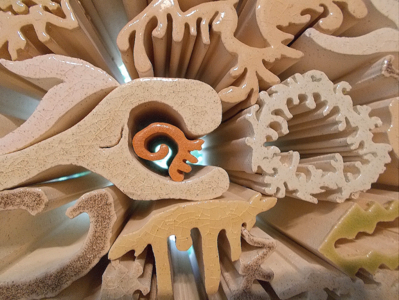
Relationships step in a nutshell: This is the step where you compare and contrast parts of the design. If there is subject matter ignore it in this step. Still no opinions yet! Simply focus on how different parts of the design work together.
Here are some ideas for things to look for:
Size Find the largest shapes and the smallest shapes in the work. Look for shapes that are about the same size. Are there large differences in sizes?
Shape Compare different shapes with each other. Look at the edges of shapes and where they meet. Are the edges mostly smooth or mostly jagged? Are there some of each? Are even shapes contrasted with uneven shapes? Are the edges curved or angular?
Color Is the work bright and colorful or more subdued? Are there contrasts of color? If there is not a lot of color are there contrasts of light and dark? See if there are warm areas of color contrasted with cool areas.
Space and Form Where are the forms located? Is there a strong foreground, background and use of perspective? Or are the shapes mainly on the surface? Are the shapes three dimensional looking? Look for negative and positive use of space: positive space is what appear as objects, negative space is the area in between those objects. How does the amount of negative and positive compare?
Texture and Surface Decide whether textures are actually part of the materials used, or if the texture is an illusion. See if there are both highly textured and smooth areas in the work, or if the work has an evenness of texture.
The comparisons you can make are nearly endless. You can compare shape and color, light and shadow, big and small, rough and smooth, size and texture.
At the end of this step try to decide what relationships appear to be the most important. For instance, you might decide that the main contrasts are between the sizes of shapes, and bright and subdued color.
Don't worry about finding every relationship; the major things you notice are likely the most important.
The Rapidian, a program of the 501(c)3 nonprofit Community Media Center, relies on the community’s support to help cover the cost of training reporters and publishing content.
We need your help.
If each of our readers and content creators who values this community platform help support its creation and maintenance, The Rapidian can continue to educate and facilitate a conversation around issues for years to come.
Please support The Rapidian and make a contribution today.