Today is the last day to cast wide your votes. Until today I was a staunch non-voter for several reasons. I believe that art is intrinsically awarding on its own, both for the maker and the viewer. I worry about mass appeal. But ArtPrize wants to attract as many participants (and dollars) as possible, and so claims to be “radically open." Consequently, the vital role of role of art experts, educators, curators and critics is minimized. I'm okay with the fact that not all venues are as radically open as ArtPrize might claim. I just wish those with reasoned selections would have taken the time to share or- dare I say- educate the public about that criteria.
In the meantime, I’ve changed my mind about voting. I’ve thoroughly enjoyed watching people get crushes on art and fidget for their phones to text their votes, like they’re sending emoticons to the cute kid in study hall. Voting gets people to care. But I am left with a problem: I desperately want good art to win. It’s purely selfish. I don’t want to be from that city whose new mascot is a 12 foot fairy made out of Silly Putty.
In a last ditch effort, I want to throw out some commonly agreed upon criteria for good art. It may be stuff you've probably heard before from teachers, critics, and art snobs. But it's worth repeating, I think. The following are a few questions that I pose to my students as well as myself when evaluating an artwork, along with examples of artwork that relates to that criteria.
- Is it interesting? Do you want to give it more than a passing glance? Although that last example was made up, I would totally take my picture with a 12’ puttied fairy. It would prove more interesting than some of the 2D painted ones I've seen. But does that warrant accolades?
- Is there a thoughtful correlation between materials and the meaning of the work? For example, Dana Freeman’s Landscape Reliquary utilizes plastic honey bear containers to house collected ephemera. The familiar vessels themselves reference childlikeness, sweetness, thus providing the tone for Freeman’s piece that attempts to preserve something as sacred. Sometimes, a contradictory relationship between materials and meaning can provide the interest in a work, as in Wade Gugino's large-scale backlit glass comic book titled Comangra City: The Huge Glass Comic Book at the Grand Rapids Public Museum. Gugino's material preference of glass over paper for his comic imagery denies this familiar drawing style its expected associations with edgy street appeal. Gugino's piece also serves as a reminder that artist statements serve only as a guide and shouldn't limit or inflate our understanding or appreciation of their work. His statement that his piece showcases "just how amazing comics and graphic stories are" adds nothing to the piece. But who cares? Actually, I might-- inflated labels might just deserve their own review...
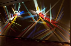
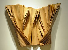
- Is it innovative either in its use of materials or concept? In his piece, Castled Void, Stephen Knapp creates a prismatic orgy utilizing only two directional lights, colored film sandwiched between cut glass. Simple concept, ingenious execution. If it’s simple in its material choices, does it transform the materials in a fresh, unexpected way? I love an unimpressive material list that reads, Wood and glue but then looks like Barbara Cooper's Peel at F. Meijer Sculpture Gardens. Or take Mark Rumsey’s The Sky is not Falling in which the hands of countless volunteers transform white copy paper into origami on steroids, and musical performances transform the ceiling installation into an etheral net to catch their songs. I really hope we see more of this marriage between crafted art and performance.
- Is it of its time? Does it engage issues and themes that are relevant today? UICA, in keeping with its mission, delivers some of the most trending topics in original packages. Michele Brody’s Nature Preserve tackles environmental concerns with deft specificity. Its sterile, minimalist presentation of native Michigan plant life in spotlit, giant test tubes seems to critique certain attitudes and efforts that aim to protect wildlife by keeping it unnaturally separate from that which is lived.
- Does it stick with you long after I’ve looked at it? Is there something there worth remembering or further unpacking? Or does it smack you with a one-liner? Sometimes artwork that initially draws you in disappoints after you’ve thought about it for an amount of time. Artist Ed Ruscha propagated the handy rule, Bad art is ‘Wow! Huh?’ Good art is ‘Huh? Wow!' Austin Collins’ Technophilia II at Meijer Gardens elicited a chuckle from viewers when they recognized brand names such as Sony and Hewlitt Packer etched on tombstones next to cement coffins that displayed obsolete electronics. But the piece lands with a thud, stopping woefully short of provoking sustained dialogue or even visual interest. Like many viewers, I was hypnotized by the undulating movement of David Bowen’s data-animated wave, tele-present water. The tension between the crude industrial materials and its graceful movement initiated by water patterns miles away lodged this piece deep into my subconscious. I won’t be forgetting it anytime soon.
- Does it allude to something larger? Does the work reference ideas and realities beyond itself? Does it remind you of multiple things? Catie Newell’s Salvaged Landscape is compelling as form itself-- its tight construction of spear-like boards, alternating patterns of dark/light, geometric/gnarled, void/mass. Then you learn that the massive sculpture is the repurposed scorched innards of a Detroit home hit by arson. As she monumentalizes the tragic landscape of our not-so-distant neighbor, Newell urges viewers to consider the implications of examining this ghost of a place in its tidy new context. The work embodies all sorts of uncomfortable contradictions-- womb/ death-trap, residue/monument, birthplace/burial... These contradictions allow for multiple interpretations that make the work bigger than itself.
Forgive me if I’m reiterating what all the other art nerds keep saying. We don’t want to spoil your fun. Really. Let pleasure be your guide. No one has to give you permission to like something. But $250,000 isn't a subjective idea. For the sake of those of us who call this city home, it'd be nice to see that prize go to something with staying power.
The Rapidian, a program of the 501(c)3 nonprofit Community Media Center, relies on the community’s support to help cover the cost of training reporters and publishing content.
We need your help.
If each of our readers and content creators who values this community platform help support its creation and maintenance, The Rapidian can continue to educate and facilitate a conversation around issues for years to come.
Please support The Rapidian and make a contribution today.


Comments
Standing in front of Mia Tavonatti's 'Crucifiction' with check list in hand.
1.Is it interesting? Oh my yes. It's so large and so life like. I wish we had one in our church.
2.Is there a thoughtful correlation between materials and the meaning of the work? Well I suppose so. Jesus died for our sins and all those little pieces of tiles could represent all of our sins, you think?
3.Is it innovative? Absolutely. I have never seen a Crucifiction so large made out of all those little pieces of glass and stuff.
4.Is it of its time? Yes. Absolutely. We have so much suffering in the world and times are hard and it is important that we remember why we are here and that we are a Christian Nation.
5. Does it stick with you? Oh yes. I can't get it out of my mind. I asked the artist if she had any posters or something of it. I took one of her cards. She signed it for me!
6.Does it allude to something larger? Like mean something else? Yes it means that Jesus came down to earth and died for our sins.
I'm so glad I get to vote.
so then, in your mind, what criteria exists for evaluating art?
All these things that Tori suggested are sound questions to consider when "evaluating" art. But is that what the average person is doing when they are texting their vote? My snide little spoof was made to suggest that Tori's questions don't make a beans of difference if ArtPrize is selling the notion that you don't have to "evaulate' anything, you just have to come downtown, spend some money on swag and vote for what you like.
"...you just have to come downtown..." except for the location Tori cites.
As a civic booster and perennial A/P volunteer, I'm in agreement with the Press' Art Curmudgeon who suggests that Grand Rapids Township should not be included in the event. Never made it out there to see their exhibits, not going to change that.
I remain a "staunch non-voter", but I really appreciate the tone (and content) of this article, Tori. It's succinct, sincere and well-said. I also share a great degree of Richard's cynicism. I'm not convinced that the General Public is interested in any "education" that the well-curated sites (UICA, Site:Lab, etc.) would have to offer. In fact, I suspect that it's this sort of notion (that art "experts" have something to "teach" them) that fosters the GP's resentment and renders the "everyone's taste is equal" voting model of ArtPrize so popular. The non-art person revels in the opportunity to express their indignation. My own siblings have made this clear to me.
Tori, thank you for voicing a way to improve the conversation about art. The criteria you have set forth can and should be used to assess what we consume as part of our shared visual culture.
I think Tori's article is well written but her analysis far surpasses her choice of questions. These questions, as Richard's spoof indicates, just do nothing to equate the analysis with what you're trying to achieve--"win for good guy's art." Scan those answers again and the real questions to ask are in there.
Tori, great article. As one of the more pedestrian art viewers, I appreciated this perspective. I may even print out these questions and put them in my wallet!
Okay, so maybe the cream didn't exactly rise to the top by voting. I'm still looking forward to further discussing and evaluating the substantive work that's out there. And maybe now that the "winners" have been announced, smaller crowds will enable you to really enjoy the thought-provoking and simply beautiful work at certain venues not represented by The List.
I'm going to second Tori's pointing to impact, to what sticks. That can get translated into a fairly two-dimensional result, what appeals to the eyes, a sort of aesthetic junk food. But the test of art is what sticks, what memory enshrines. At the end of the day, the problem with craft-oriented material is its sheer forgetability. A year later, Svtletana is already disappearing down the memory hole.