New Feature Tuesday: Suggestions Slider

From The Rapidian Staff
Each week, a Rapidian staffer will publish a piece related to goings-on at The Rapidian, developments in the world of citizen journalism and tips for making the most of the site. Click here for past editorials.
From The Rapidian staff: A new feature announcement on a Tuesday can really only mean one thing. That’s right, it’s New Feature Tuesday!
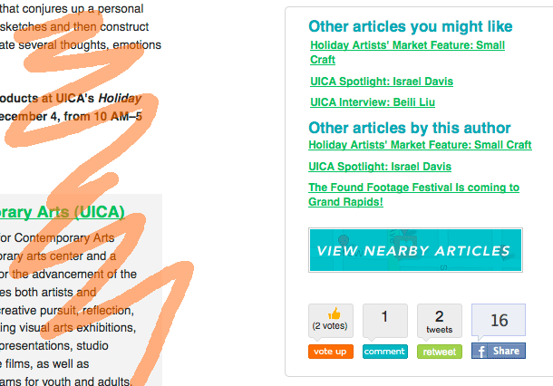
This time we only have one new feature that we are ready to talk about, the suggestions slider, and actually it launched a week ago Monday. In addition to awesome alliteration, the suggestions slider provides a sampling of Rapidian content that is related to the story you are currently looking at. Here’s what it does:
Lists up to three other related articles
Pretty straight forward, the suggestions slider lists content that probably seems related to whatever piece you are looking at. It does this by looking at what the current article has been tagged with and finding the three others in the database that are most like it. Moreso than ever, this makes it really important for you Rapidian reporters out there to tag your articles carefully. A tag like “Grand Rapids,” for example, probably isn’t necessary on The Rapidian because ALL of the content on the site is about Grand Rapids and it will skew the results, bringing up things that may or may not actually be related to your article.
Lists up to three other articles by the same author
If the story’s author has added other articles to The Rapidian, up to three of the most recent ones are listed here. If the article was added by a new reporter who hasn’t yet contributed any other articles, you will not see this list. Do not be alarmed. Sometimes we launch things on the The Rapidian with little fanfare because we want to try things out on the sly and see what people say about it. We’ve actually already made some changes to this feature based on feedback we got on Facebook (see sidebar).
Links to the Nearby Articles map
I wrote about this feature last time. It’s basically a big map that plots out all the articles within a quarter-mile radius of the article you are looking at. But with the suggestions slider, it's a little more in your face. Like the other articles by the same author feature, this link will only appear when the current article has been mapped.
Action Items
Vote up, comment, share on Twitter and Facebook. You recognize these features from the top of the article, but now you don’t have to take the trouble to scroll up when you’ve finished looking at something. The Rapidian: Preventing pointer-finger arthritis one article at a time.
If you have any feedback about the suggestions slider or ideas for new things we can add to The Rapidian to make the site better to use, please feel free to comment below, email us or throw something on our Facebook wall. That totally works too.

A core service of the Grand Rapids Community Media Center


